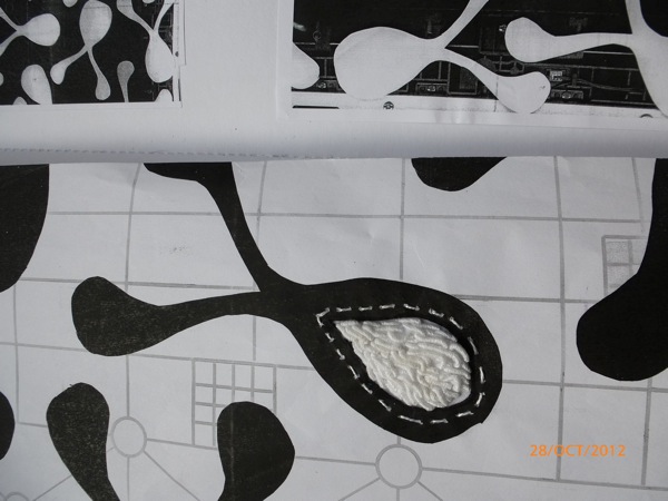
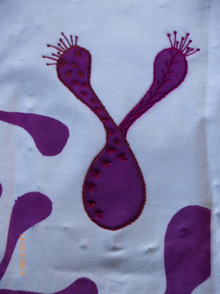
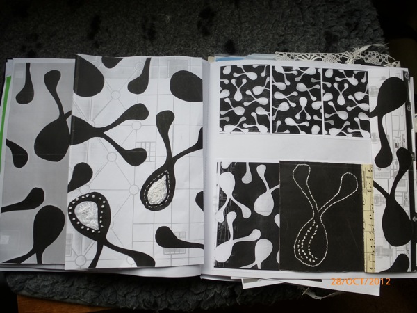
In between helping my elder son prepare a costume for his first Halloween "home alone", I have been continuing to explore the shapes from my first ledger exercise. A fortuitous mistake with the Morley photocopier, led to an interesting juxtaposition of a grid underneath the more biomorphic shapes. The paper is reinforced with iron-on vilene to allow reasonably robust stitching on top.
I also used the copier to experiment with changing scale, inverting the colours of the shapes and multiple repetitions. This is such a revelation to me, that design can be worked at methodically to come up with all sorts of interesting variations. Before doing my recent courses, I had this image that design / art just appeared in makers' minds, fully formed and as a result of some sort of cosmic inspiration force. I now realise that this is not the case.
The left hand side has more stitched inserts
and the right hand side has some stitching in glow-in-the-dark thread. Difficult to photograph, but this gives the idea.
Happy Halloween.
Sunday, 28 October 2012
Sunday, 21 October 2012
Ledger, loving it, but I'm still on week one
I am absolutely loving this online course, but I am still fixated on the shapes generated during week one. I am applying some of the other techniques we are learning, but by now, I am supposed to she another design source, and a study of lace, with its derivatives. Still, Karen is a generous tutor, and is happy for us to develop our skills as we wish or need, and not to rigidly follow her curriculum. The week's explorations follow.
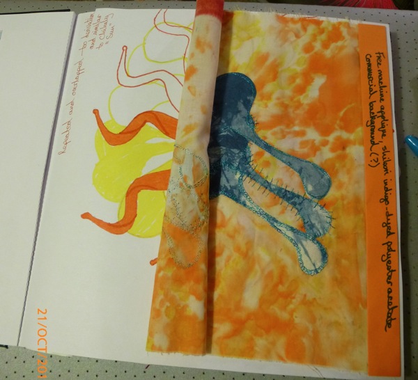
Overlay page and its inverse. The inverse is a photocopy, as I am using the inverse fabric piece for another ongoing project.
Shibori, indigo dyed polyester acetate, attached using Bondaweb, due to the narrowness of the stems / arms/ branches/ tentacles. FME, with rayon thread, using different patterns of stitching.
This was the page I really didn't like , so I've covered it up with an overlay, but still kept it so it can be seen.
The orange piece is screen printed paper, reinforced with lightweight Vilene, and machine stitched with wool thread. The marking on the magenta page was seeing if I could continue the "quilting" lines on to the overlay.
Top sheet is painted paper backed with very soft Vilene, with embroidered inserts. This overlays an inserted panel of the same paper, ( also reinforced with Vilene) . The background paper is coloured with Inktense blocks, and stamped with lettering from an acrylic blocks set found in a charity shop - some letters missing, so I had to improvise. The paper shapes are the left-overs from cutting the paper stencils for the screen-printing. I like their floppy characteristics, so I stitched them together and included them in the ledger.
Mounted with a piece of paper from an old music book, and lots of ideas spinning in my head from the two stitches added to the music.
Underneath - stitched paper, inserted in to the background paper.
Friday, 19 October 2012
Sketchbook project - can you get there today?
After Morley yesterday, I went to visit The Sketchbook Project , touring to Canada Water library this week.
What a joy. An opportunity to leaf through the 5 x 7 sketchbooks of participants from UK, the rest of Europe and Australia. Also it felt like a truly social event , with no obsessive security measures, great music playing, friendly and helpful staff. Perhaps it is because they are not hidebound by the increasingly ridiculous health and safety elements of many buildings in London these days but it felt like going back in time. Bags left all over the place as people enjoyed what they were looking at, drinks and food being taken alongside the books, no-one concerned about photographs being taken of the books or of other readers, and generally a very relaxed atmosphere.
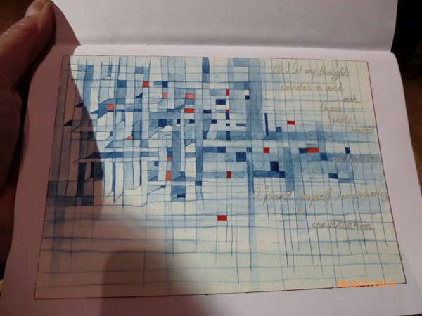
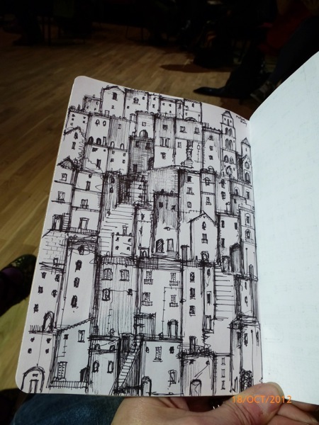
Books were developed to set themes, but at times, my friends and I were baffled at how the themes had been interpreted by each participant. These pages caught my attention
Today is the last day. If your are in London, it is a short journey from Waterloo on the Jubilee Line. Well worth a visit.
Sunday, 14 October 2012
Colour in the garden and more ledger
We still have sweet peas flowering, but they are getting towards the end of their flowering. The colours are still as vivid, but the scent is no longer as wonderful.
These colours also appear in the ongoing work in the embroidery ledger
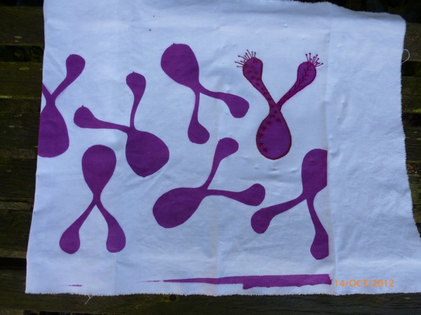
Screen printed shapes with Procion P dye paste, through a paper stencil, on to recycled cotton sheet.
Stitching in to the screen printed shape with stranded cotton and cotton perle: pistil, feather, chain stitches and fresh knots.
Tuesday, 9 October 2012
Am I a professional now?
Our biennial quilt show went off superbly this weekend. Over 600 visitors, a good sum of cash raised for the Royal Marsden, and much pleasure given to all. Our venue always looks strangely empty when the quilts are hung, as it is so large, and there is a bit of a last minute worry as to whether there is enough for visitors to look at.
Finished quilts from the Jan Hassard workshop.
However, when people start coming in and appreciating the space that there is to get a really good look at the quilts, both close-to and from afar, those worries are put aside.
I was working on Friday so came in to the exhibition on Saturday to see a "SOLD" sign on one of my small quilts, which was very exciting. And the excitement continued through the day when I sold two more. Not enough to give up the day job, but glimmers of that portfolio career appearing.
The proceeds of this one are going to charity as the design is by Pat Archibald and it is not my own design.
River Race, all my own work, design and fabric dyeing, ( far left) also sold.
As did lower right " Unexpected item in the thinking area".
Visitors' choice can be seen on the Richmond and Kew Quilters Facebook page, and hopefully this week, on our website.
A great few days and thanks to all my friends who came to visit.
Afternoon sunlight reflecting through the stained glass on the pillars above the quilts.
Thursday, 4 October 2012
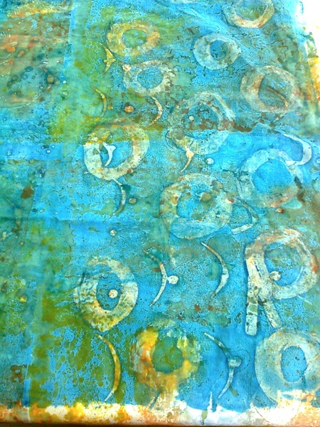
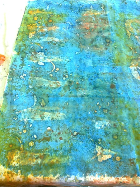
Breakdown printing, initial results
All looking very organic. The plastic embedded objects are pulled off, and then the screen is used to print by pulling Manutex through it until the dye is exhausted.
The initial cloth then had soya wax applied and Procion P dye paste scraped over the whole piece with a credit card ( this is very therapeutic). Below shows the cloth before the wax has been washed out.
I think this is an either love it or hate it technique. If one is obsessed with precision and definite lines, this is not the right method. If one enjoys a more serendipitous approach, this is great fun.
Labels:
batik,
breakdown printing,
colours,
contemporary,
dyeing,
Morley College,
New Category,
textiles,
texture,
transparency
Tuesday, 2 October 2012
Embroiderer's Ledger, task 2
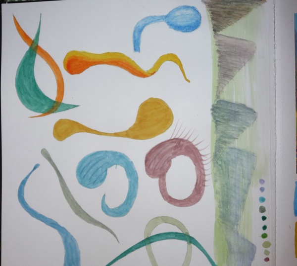
Next task is to separate out some shapes from the image, draw them and work with the extracted colours to explore them further.
I couldn't get anything beautiful out of the mountains in the background -that's the attempt at the side. As I was drawing, I realised that I wasn't happy that my shapes were looking like peculiar breasts, so I've simplified them. ( Any advice on how to convey the twisting in the dominant yellow shape from the image would be greatly appreciated. I've tried to draw it in with the yellow and orange shape here, but it isn't too my liking yet.)
I really like the possibilities of overlaying of shapes and blending colours, but that may be beyond my technical capabilities. Trying to match colours under artificial light is tricky, so I'll need to do something about the quality of the light under which I am working. The colours are actually not as bright as this on the page, I'll try to re-photograph under natural light.
It takes me a while to get in to the swing of these exercises, but once I do I am really enjoying them.
Next step is to stitch in to these shapes.
Labels:
embroiderer's ledger,
hand embroidery,
Karen Ruane,
workshop
Monday, 1 October 2012
An Embroiderer's Ledger, first task
A colour - filled weekend, working on the first task in the online course with Karen Ruane, " An Embroiderer's Ledger".
" All" we had to do was to choose an image, extract colours in two different media, and then match threads to the extracted colours. To the non-art trained, this seemed a mind-blowing job. Once I managed to select my image, it did prove challenging, but strangely relaxing at the same time. The page below is the result, image about 4 x 6 inches, and the page is abut 12 x 12 inches.
Postcard of Dale Chihuly glass in the desert. Watercolour and coloured pencil showing the extracted colours.
I am using threads that were left by my husband's mother's cousin, therefore many of them no longer have identification bands. I am keeping them on a ring so that I know what shades I used. I found it really difficult to match the ochre, sage green and light turquoise shades from the stock I have, so ended up using blends of threads for some shades.
I must wear something with tighter fitting sleeves when doing this exercise, as some of my circles are distinctly blurred.
The next task is to extract some of the shapes from the image and work those onto a page with some stitched samples. I'm trying not to get nervous about the thought of having to draw - perhaps the scalpel will come out again.
Labels:
colours,
course,
hand embroidery,
Karen Ruane,
workshop
Subscribe to:
Posts (Atom)