Pages

Showing posts with label disperse dyeing. Show all posts

Saturday, 1 March 2014

Morley - textile printing development

More testing this week of different finishes between sections of the cloth, different colours - not so much red and contemplating the overlaid shapes.

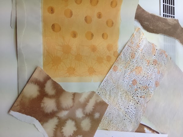
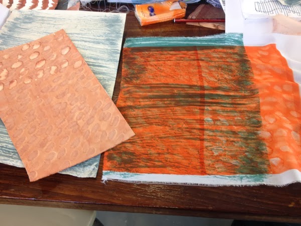
Discharged papers

IMG 0239

Detail from papers printed on to cloth

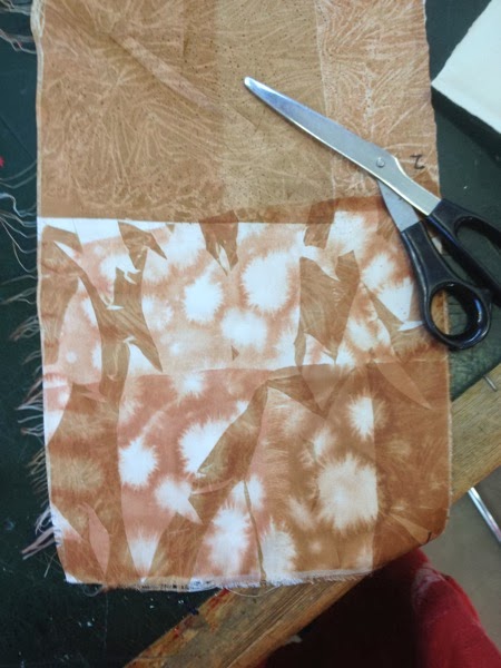
IMG 0240

Whole test piece

IMG 0238

Now I need to consider the proportions of each shape, the degree of overlay and the different colours to be sued - all before next Tuesday as that is the last whole day in the studio before the deadline.

Tuesday, 11 February 2014

Trees, development of disperse dyeing

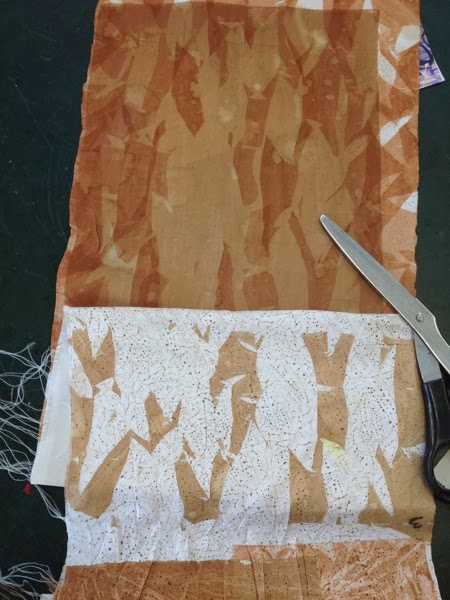
The deadline is approaching for the Made at Morley competition, where I have been trying to develop my tree theme.  Today was an exploration of khaki / brown colours and different textures.  I'm veering away from actual depictions of trees and more towards  textures that suggest bark , battlefields, broken trees.

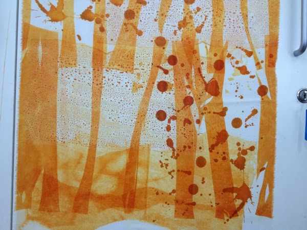
Discharged papers after printing

IMG 0233

Section of printed cloth

IMG 0231

Next section

IMG 0229

Final section

IMG 0228

It was interesting how different people interpreted the jagged shapes.  I've been looking at the tree trunks for so long, that is all they said to me, but others saw marching legs or barbed wire.  Both very appropriate in the circumstances.  I now need to work this colour palette in to the previous teal / orange colour way and develop ways to get smoother transitions between one section and the next.  The stitched trees are just jarring with the print at the moment, so I've decided to stick with just print and see where it goes.

Tuesday, 21 January 2014

Morley morsels

Busy day today on the heat press, testing out the painted papers prepared last week.  The top one shows fingerprints and drops of water in lower left and cling film applied to wet dye on the top right.

IMG 0209

I was pleased with the colour mixes and with the effects of some of the papers.  These prints are all on a lovely drapey polyester.

Underlayers of orange dye, with overlay of dark teal dots ( a serendipitous result of a an error - painting the dye on to greaseproof paper)

IMG 0208

Overlays of dark turquoise on orange explosions

IMG 0207

Turquoise lines on orange explosions

IMG 0212

Trees cut out of painted papers and then printed over orange explosions and dark turquoise dots

IMG 0206

Whole pieces taped up for contemplation of next steps

IMG 0215

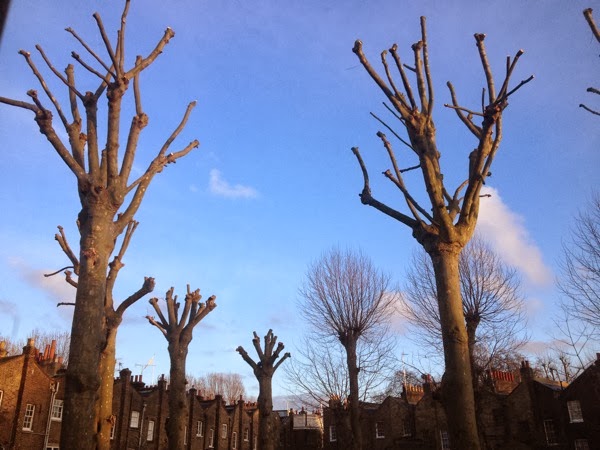
Pollarded trees in the Morley gardens seemed to be fitting in with the theme today.

IMG 0210

IMG 0216

Out tutor also referred me to the work of  Sally Greaves-Lord to study for homework, so lots to do.

Wednesday, 6 March 2013

Journal quilts, February, Cumbernauld

P1000631

We moved to a brand new, 3 bedroomed, terraced council house in a Scottish new town. My overriding memory is of the stark white of the houses with their black wooden cladding. This contrasted with small remains of beech woods, across the pavement from our house where we climbed and played adventure games.

 White sheeting, black cotton stitched into pintucks. Grey linen, machine embroidered with rayon threads, then trapunto stuffed. Machine embroidered ono the trapunto with the post code using the alphabet function on my sewing machine. I like how the lettering has become abstracted due to using the walking foot and moving the stitched line away from the linear alignment. The far left section is a transfer print of a map of Dalmuir, overlaid on the sheeting, with the extending threads representing the memories of one place influencing those of another. I had planned to add quilted circles to represent the bridges, underpasses and roundabouts of the new town design, intended to keep pedestrians removed from traffic and hence safe. I decided against that, as it made the design too busy. Perhaps I also omitted these as it reminded me that the town centre, devoid of pedestrians, was a soulless, draughty, grey, drab, frightening expanse of concrete.

Details of machine stitching and overlaid map

P1000632

Detail of simulated beech tree surface

P1000634

Sunday, 5 February 2012

Transferring my affections

Transfer printing, strangely enough to those remembering wet sponges and faded transfers on summer skin, is a completely dry fabric printing process. This half term at Morley we are focussing on this technique, particularly on mixing and controlling our own colours.

When I tried this during the previous course, we used the stock colours, which was fun, but not subtle.

I bought 3 cheap fabrics labelled "polyester" but with different finishes to really test out the technique. First attempts were a repeat of last year's method, painting the disperse dyes on cartridge paper, letting it dry, and then transferring to the fabric in the heat press. This technique is limited by the size of the press, so most of these single samples are about A3 size. Out tutor, the very patient Marian, is keen that we explore the painterly effects of the techniques we are using. I must be getting somewhere with this, as the phrase " painterly effects" used to send me twitching in to a corner.


P1080115
Getting more methodical, my dye recipes are written on the cloth. This is a horrible, shiny polyester, but is transformed by the printing process.

Next, painting leftover dyes on to paper in random patterns to see what colours develop. Then using these papers with photocopies of images. This image was an enlarged photocopy of a hand-embroidered piece I did on last year's course. Using the positive and the negative of the paper, gives a positive and negative of the image. Might be worth exploring, but this painted paper is too busy to allow the image to show through.

P1080105

Next using an indulca resist ( can't find a link about that, it is a bean paste I think) on our silk screen images, printing the indulca resist on to the painted papers and then printing from that. Also trying out multiple prints from the same piece of paper, to see how many prints, of increasingly fainter quality can be made from one paper.

P1080107

Beautiful transparency with this fabric, despite the rather overly vibrant orange and pink.

P1080110

Lots more to come.

PS just corrected some autocomplete spelling mistakes that I didn't notice yesterday.