Last day before half term, and a chance to print up the sails at twice the size, with the Procion P dyes, using more complex mixes of colours. I also wanted to see if it was possible to get an ombre effect with the dyes.
Sails detail, showing some success with the ombre at the far left, although also showing some inconsistent application of the dye paste, making it a bit streaky, particularly in the blue. This is a much finer cotton poplin, and also had an interesting watermark effect left once the dye had dried.
Full length, one direction
Full length, from opposite direction
I love this technique.
Then off to Prism for a meet-up with Morley friends from last year. Well worth the trip if you can make it there by Sunday.
Thursday, 31 May 2012
Saturday, 26 May 2012
So, on the hottest day of the year so far, we use the smelliest process in the studio………
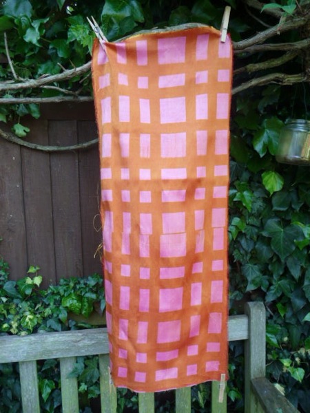
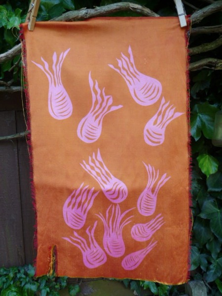
Discharge printing, on fabrics that I have dyed previously and on silks from india that have been stashed away for years. This was also a chance to try out the new screen made with the paper cuts and to repeat a bit of "Charles Rennie Mackintosh meets Frank Lloyd Wright at the Willow Tearooms".
The lighter patterns appear solely as a result of the discharge paste being applied through the silk screen. As I didn't dye these silks myself, I had no idea what the result would be. Excitingly, they are all lovely, details below.
Charles Rennie Mackintosh etc, the first on shot silk dupion and then on tightly woven paper silk
Papercuts
Papercuts on dyed, waxed, dyed again cotton
The paste has to be activated by steaming, so the studio was baking. All worth it though.
Labels:
dyeing,
Morley College,
screen printing,
silk
Thursday, 17 May 2012
The sails are printed
From here to a printed length this week. Five separate paper stencils, 5 different mixes of Procion P dye, carried on to the cloth with Manutex paste, ( I can't find an internet link about this method) lots of measuring, and it does approach the initial design.
Detail
Detail, showing scale of image
Full length of cloth, showing dye testing on the bottom selvedge
The advantages of this method are: it doesn't need huge amounts of water; the dyes are very true to their final colours during the printing process; mixing the colours is very straightforward and subtle variations are easily achieved; the overlay of colours is subtle; the hand of the fabric isn't changed.
The disadvantage is that the dyes have to be fixed with steam, which is fine in the studio which has a bullet steamer, but is a bit more unwieldy at home.
Lots of learning in this exercise about working with paper stencils, overlaying colour, measuring up a repeat, managing a long length of fabric. More to come hopefully as I have now cut a set of these shapes at 200% of the original size.
Tuesday, 15 May 2012
Angie Lewin - glorious design, and upcoming exhibition
I have just picked up a copy of "Plants and Places" by Angie Lewin from our local library. I am treating myself to an hour with it, after being soaked, and stabbed by rather large hailstones, on my bike.
It is glorious: excellent print design, beautiful photography and superb heavy paper.
Even better, there is an exhibition of her prints in London for the next two weeks, here, and should coincide with a planned visit to this year's Prism exhibition, "Hidden Places, Hidden Spaces".
So much to see, so little brain available to absorb it all.
Labels:
art,
contemporary,
New Category,
printng,
Prism
Saturday, 12 May 2012
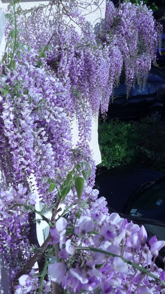
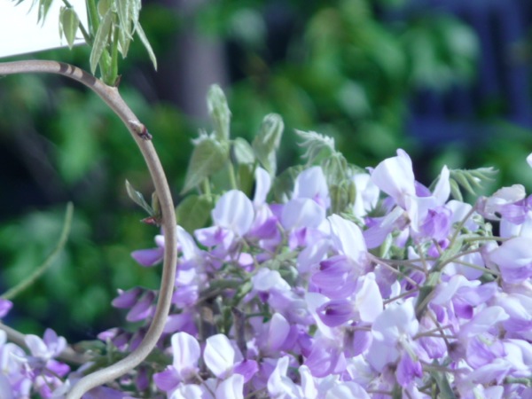
The sun has got his hat on….. and the wisteria is coming out to play
Needs no words
Finally getting to grips with the electronic zoom on my camera
Thursday, 10 May 2012
Inspiring visit to Designing Women exhibition
As part of our course, each term, there is a visit to an exhibition, usually with a textile theme. This term's was to the Fashion and Textile Museum in Bermondsey to see an exhibition celebrating the talents of a group of British women designing textiles from the 1950s onwards. On until 16th June, this is well worth a visit.
The graphic quality of these designs is still striking, and a few of these designs are still in print, particularly Calyx by Lucienne Day.
The Fashion and Textile museum is great value for money as there is always an additional exhibition or two showing in the same venue. This time there is an exhibition of The Printed Square ( about handkerchieves - more interesting than it sounds and accompanied by a lovely book) and one about Sanderson and their textile designs. It shows how their designers use a combination of archive material, painting and digital technology to arrive at current designs.
I also crammed in a visit to The London Glassblowing Studio, on the same street. Even more mind-boggling than usual, not only the glass on display in the gallery, but the astonishing artistry of the blowers, who were blowing giant, brilliant red and black glass poppies as we watched, for future display at this exhibition.
Full of inspiration, back to the Morley studio, where it took me two hours to print 9 triangles - it's all a learning experience.
Tuesday, 8 May 2012
Images from the dye bath
A rare sunny afternoon, and I took the opportunity to do some shibori over-dyeing of previously dyed pieces. Swirling the dye bath out after wrapping the cloth in cling film gave these great images.
I'm trying out a watermarking software ( Star Watermark) and I haven't got to grips with how to use it fully so don't try to read the very, very,very small watermark.
Reflections
Reflections
Wave forms
Face in the cloud
We are not alone
Don't burst my bubble
Volcano
I'm trying out a watermarking software ( Star Watermark) and I haven't got to grips with how to use it fully so don't try to read the very, very,very small watermark.
Reflections
Reflections
Wave forms
Face in the cloud
We are not alone
Don't burst my bubble
Volcano
Sunday, 6 May 2012
May journal quilt finished
As the weather is not conducive to being outside, that means lots of time for planning Morley projects - cutting five different paper stencils, aiming for an overall design of the sails shown in a previous post, and completing a couple of journal quilts.
May is the first of the yellow themed quilts for the Contemporary Quilt Group challenge. I've decided to keep a link between the months that are next to each other in the colour challenge, by including some red in the first month's yellow quilt.
Hand-dyed fabric, with hand embroidery as quilting, combined with machine embroidery. Binding was machine – embroidered before stitching to the piece.
The balance of this piece went all wrong when I realised that I could not wash out a mark left by over-zealous use of spray adhesive. I therefore had to cut off a piece of the red and try to regain balance by adding the machine quilted lines at the bottom.
The binding proved to be difficult to colour match to the main body of the piece, hence the number of seams in the binding strip.
Labels:
A4 challenge,
challenge,
contemporary,
quilts
Thursday, 3 May 2012
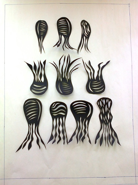
Papercuts, moving ahead
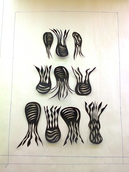
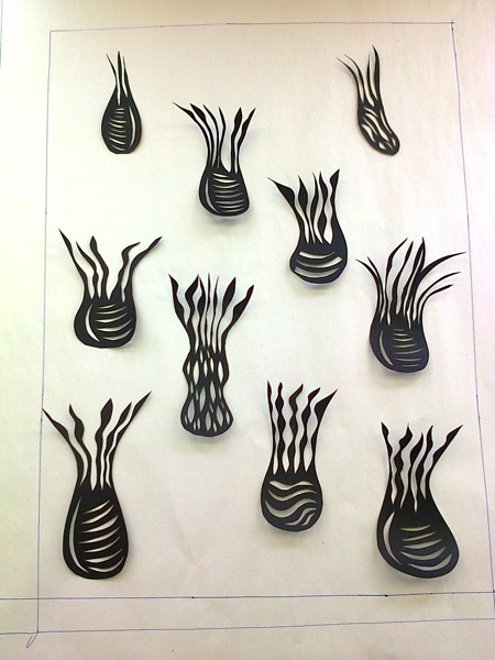
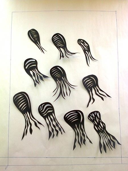
No printing this week, but lots of planning, for my new photoscreen and for a design for a piece of cloth on the theme of the Olympics. The cut shapes have developed, and today was time to work on layout ( approximately A3 size). The advantages of the mobile phone are very apparent at this stage, as it is possible to quickly rearrange elements in a composition and then record them in a photograph.
Tiered, linear array
Tiered, linear array with inversions
Linear array, offset elements
Diagonal array
Random array
In the end, with the help of the saintly Marian, I've gone with none of these, but with a cluster or elements and some straying pieces, in the hope that this will give me more variety in the use of the screen. The phone ran out of battery, so pics of that will need to wait.
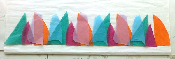
Also today a return to the Olympics project. I have been so unenthusiastic about this, I've really struggled to get to an image. Eventually I've gone with sailing because: I have sailed myself; sails are very graphic and come in lots of shapes, sizes and colours; Britain has a great Olympics sailing team. Again working with cut up paper, tissue this time, overlapping. Inspiration came from lots of images of sails, and playing about with overlaying colours of the tissue. This starting model is about 60 cm long.
I hope to match these colours using the dye recipes from the workshop last weekend and to exploit the transparency of the Procion P dyes.
Labels:
design solution,
Morley College,
Olympics,
paper,
screen printing
Wednesday, 2 May 2012
Dyed and going to heaven
No time for blogging as I've been too busy "doing". First up, the results of a dyeing workshop at Morley over the past two weekends.
Led by the ever patient Marian, a group of 10 of us chose two Procion MX dyes, in three different strengths. In week one, we dyed cotton fabric with one colour of dye in the three different strengths and then in week two we overdyed these pieces with the three different strengths of the second dye. Sounds very straightforward.
However, in week two, add on: chopping up and labelling the 9 dyed pieces from week one into 12 separate pieces each; confusions about labelling buckets; two power cuts during the workshop; water tanks draining of water and then no power available to pump the water up to them; realisation dawning that the labelling on some pieces did not show up with the darker dyes; scrambling to catch some tiny pieces before the disappeared down the drains; untangling some of the less tightly woven fabrics; dealing with the security guards telling us that the college was closing early because there was no power to the cctv cameras, and it all became a mad scramble at the end. We did all manage to swap a full set of colour swatches with each other, and as we have a note of everyone's dye recipes, we now have a collection of these glorious colour families.
Hot spice
Coffee in the deep forest
Summer pudding
Distant mountains
Best loved denims
Winter nights, Ooops, one piece missing here
Sooty cranberry
Cornish seas
Sage saffron
Morrocan ice
An added bonus was that 3 of my friends were on the same course, but we hardly had time to speak, we were so focussed on getting our buckets, spoons and labels correct.
Next, more over dyeing at Morley.
First, cotton twisted and dyed in the indigo bath, then over dyed using the tray-dyeing method with a mixed blue and a brown dye. This is a double length, so the photo only shows half.
Next a very long strip, twisted and dyed in the indigo bath, then accordion folded with CDs clamped between the folds, and a mixed Procion MX blue dye applied along the edges of the folds.
I love the immediacy of the indigo followed by the slower effect of the Procion MX dyes.
Led by the ever patient Marian, a group of 10 of us chose two Procion MX dyes, in three different strengths. In week one, we dyed cotton fabric with one colour of dye in the three different strengths and then in week two we overdyed these pieces with the three different strengths of the second dye. Sounds very straightforward.
However, in week two, add on: chopping up and labelling the 9 dyed pieces from week one into 12 separate pieces each; confusions about labelling buckets; two power cuts during the workshop; water tanks draining of water and then no power available to pump the water up to them; realisation dawning that the labelling on some pieces did not show up with the darker dyes; scrambling to catch some tiny pieces before the disappeared down the drains; untangling some of the less tightly woven fabrics; dealing with the security guards telling us that the college was closing early because there was no power to the cctv cameras, and it all became a mad scramble at the end. We did all manage to swap a full set of colour swatches with each other, and as we have a note of everyone's dye recipes, we now have a collection of these glorious colour families.
Hot spice
Coffee in the deep forest
Summer pudding
Distant mountains
Best loved denims
Winter nights, Ooops, one piece missing here
Sooty cranberry
Cornish seas
Sage saffron
Morrocan ice
An added bonus was that 3 of my friends were on the same course, but we hardly had time to speak, we were so focussed on getting our buckets, spoons and labels correct.
Next, more over dyeing at Morley.
First, cotton twisted and dyed in the indigo bath, then over dyed using the tray-dyeing method with a mixed blue and a brown dye. This is a double length, so the photo only shows half.
Next a very long strip, twisted and dyed in the indigo bath, then accordion folded with CDs clamped between the folds, and a mixed Procion MX blue dye applied along the edges of the folds.
I love the immediacy of the indigo followed by the slower effect of the Procion MX dyes.
Subscribe to:
Posts (Atom)